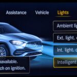
Plenty of options but slightly outdated design.
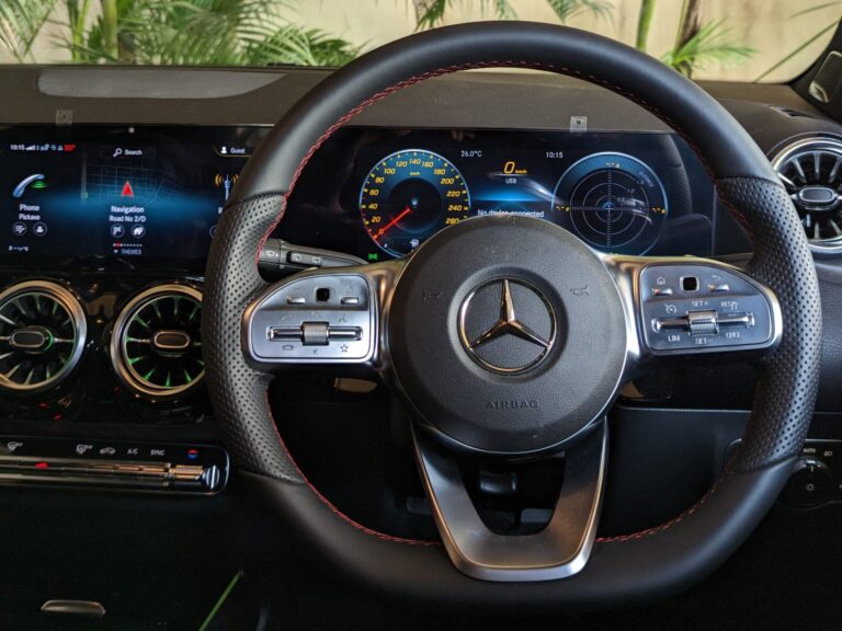
Background
MBUX (Mercedes Benz User Experience) is the latest infotainment and multimedia system developed by Mercedes. It was introduced in 2018 as a replacement to the older COMAND system. The subject in the current post is first generation of MBUX. The second generation was launched in 2022
The current system is part of GLA AMG 35. Now onto the analysis.
Design System
First off, lets talk about the design system i.e. icons, color, typography, layout etc.
Style & Iconography
Lets start of with the style and icons. In short they are outdated. The icons either have too much detail, are too sharp, old-fashioned or all three. The most glaring issue is the excessive use of gradients. The combination of high detail and numerous gradients, with different colors and intensities makes the design inconsistent and elevates the visual complexity. Collectively, these factors contribute to an overall displeasing aesthetic.
# I always feel the key to making a design look good and avoid fatigue is to keep it simple. Also I have to stress on the point that
Simplicity !=Minimalism
More on this topic in further sections.
Color
The primary colors used are shades of blue, with white font color with accent color being yellow.
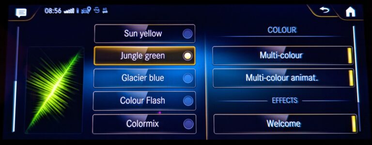
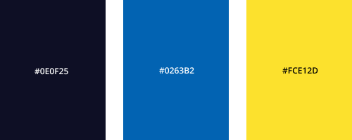
The color combination adheres to contrast accessibility guidelines; however, it leans towards darker shades, potentially impacting visibility and user experience. The palette also uses complementary colors which can be considered as harsh and cause visual fatigue. The more modern color themes involve the use of muted colors with a balanced use of complementary colors to avoid clashing. With that in mind, below is a suggestion of a lighter color palette while retaining the Mercedes Benz brand identity.
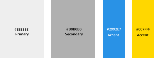
The idea is to keep the Silver Star identity with blue representing technology and yellow representing premium. The disadvantage with a lighter theme is that it is not easy on the eyes when dark. So having a dark theme is important. It’s worth noting that these colors might evolve in the future as my understanding deepens.
Typography
The contrast and font size appear satisfactory, but there are occasional concerns regarding font boldness, which may feel somewhat light.
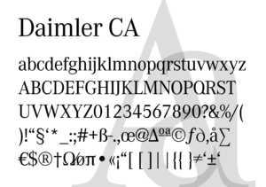
# On a personal note, there’s a preference for a different font choice as the current one appears elongated and lacks symmetry, which may affect overall visual harmony.
Layout
+ The layout is decent, featuring effective utilization of negative space, resulting in an uncluttered appearance.
Main Display
There are various sections in the main display. Lets get rid of the negatives first and start with navigation.
Navigation
Simply put, the in-built navigation is not useful.
– The map design is outdated with bad color usage and outdated/confusing icons.
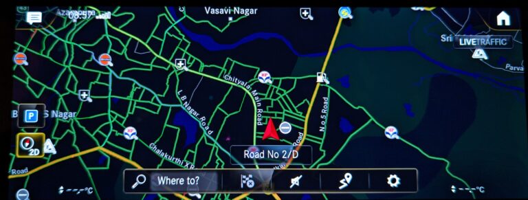
– Want to use Apple Carplay or Android Auto ? The usable screen space is limited.
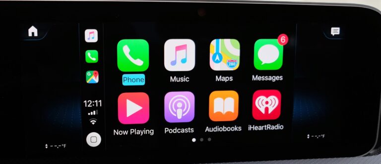
– Searching for a location doesn’t work almost always.
– Some of the icons don’t make sense? Why is there a dedicated icon for finding parking spots. Also it shows some random spots for parking. I cant figure out what the basis for it is.
– Some more examples :
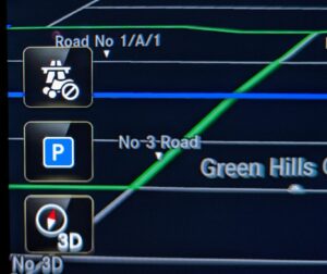
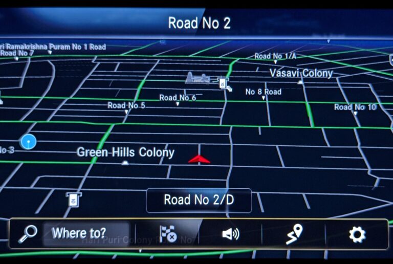
Barely interpretable “Avoid Tolls” option
Icon used for “Add a stop” is not familiar.
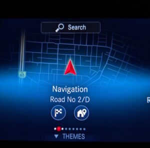
+ Only positive, or more of a cool design element is the navigation icon in the main menu also representing the real time location with a translucent map in the background.
Phone Menu
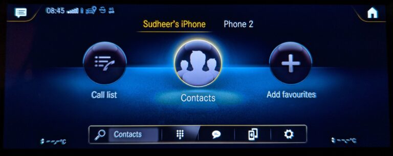
The phone menu is straightforward and simple with access to contacts, call list.
+ A notable positive is the ability to connect multiple phones simultaneously, switch between them and access contacts and call logs separately. We can further control call and media settings separately.
Radio
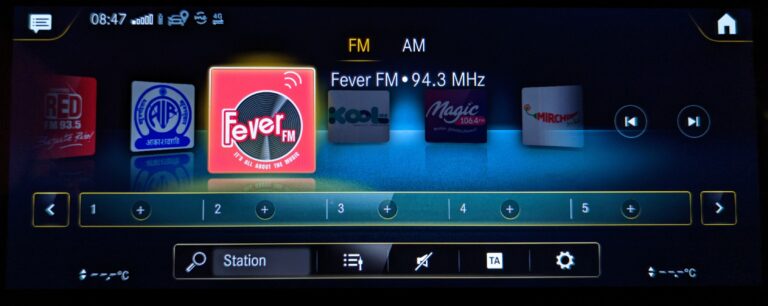
+ Radio page is good. Stations are pre-listed. Missed stations are easy to search and add to the list. Adding favorites is also simple. Modifying and deleting favorites requires long press.
Settings
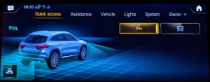
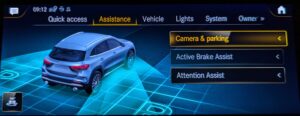
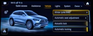
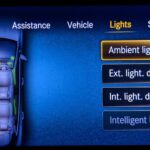
The settings section has good graphics representing the customization options of the sub-menus. The attention to detail is good.
There is also a 3D option included to rotate the car around and access the sub-menus.
Vehicle info and Mode select
This section shows real time vehicle data like power, torque, consumption and also allows to individually configure vehicle settings to suit your needs. Overall, a good looking section.
Other notable points
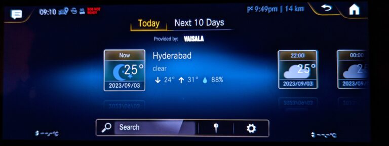
+ There is a weather app inside the “Apps” section which looks fine.
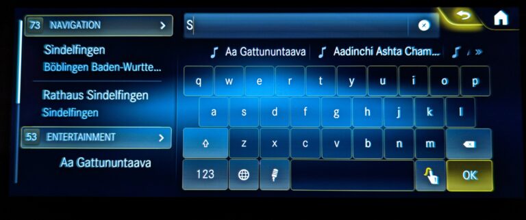
– There is a general search option on the top of the main menu which doesn’t work. Below is an image showing suggestions for letter S. I live in India incase you are wondering.
– There is option to search using gestures. The catch is you can gesture only one letter at a time, making it essentially useless.
– Wait, why not use the Mercedes Voice Assistant to search? Barely usable. Indian accent, am I right ?
Enough about the main display. Lets move onto other parts of the infotainment system.
Instrument Cluster
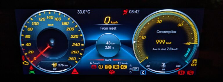
There are numerous options available for displaying information on left right and center sections through using the touchpad located on the right side of the steering wheel.
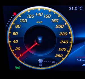
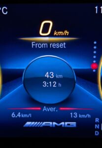
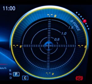
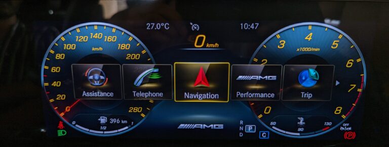
The central part of the cluster has various options. Once selected, we have the ability to enable full screen mode for that specific function. Below is an image with full screen enabled for navigation.
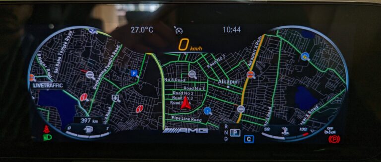
Below is full screen mode animation for the “Assistance” function.
+ The vehicle start animation is sleek and polished. In general, the motion design throughout is well executed.
Steering Wheel
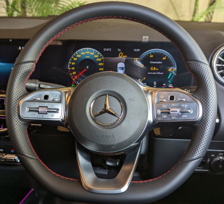
The steering wheel design has multiple layers.
1. Front button panel – Control information on the instrument cluster and center display.
2. Levers – Wipers, headlights and gears.
3. Paddle Shifters – Manual mode.
Steering controls
There are 6 buttons on either side with bottom set of 3 buttons having dual functions. These buttons are to be toggled vertically (or slide) based on function.
Right Panel
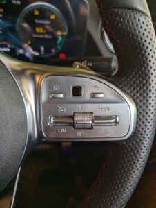
This side is used to operate the instrument cluster. Buttons on this side include,
1. Home, 2. Trackpad, 3.Back
4. Cruise/Limit, 5. Set, 6. Resume/Cancel
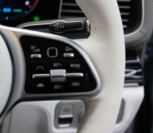
In the models with ADA (Active Distance Assist), the button layout has been modified to include the distance function.
Obervations
– The cruise control/limiter, set and cancel symbols are intuitive. But I feel that the RES (stands for Resume) symbol is slightly confusing. STRT(start) would have been a better option as RES can be confused for Reset. Also I have no idea what the landmark looking symbol along with RES is and it adds to the confusion.
+ The notable thing about the SET button is that it has 2 levels (based on pressure applied) in either direction, to increment in speeds of 1 kmph or 10 kmph.
– The system is definitely confusing at first, but so are all implementations of cruise control (or not *My knowledge is limited). In case of the models with ADA, the distance function is to be used in combination with the Cruise/Limit function further adding to the complexity. Overall the system takes some learning to get familiar.
Left panel
This side is used for interacting with the center display. Buttons on this side include,
1.Back, 2. Trackpad, 3. Home
4. Call, 5. Volume, 6. Voice Asst/Fav
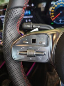
Observations
The left side has a standard layout of buttons with commonly used symbols. Some pros and cons,
+ The volume slider is really convenient with good resistance and is more comfortable than the a button layout. However including a press function (mute) on a slider is not the best implementation. (Chances of sliding while trying to mute). But given the theme, including an additional mute button would have been out of place.
– The mini touchpad works but lags behind when used at higher speed.
# Since we only need 4 way movement, some sort of 4 way restricted toggle switch works better. This way we are more sure of the direction we toggled in and can focus more on driving.
**Image of suggestion
Levers
The levers in Mercedes are different from the rest. The placement of the gear lever on the right side of the steering column is aimed at facilitating faster shifting, especially while parking, and clearing up center console space.
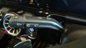
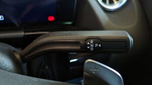
– From the driver’s perspective, the indicator is a control used significantly more frequently than the gear lever. Given that Mercedes-Benz vehicles are designed with the driver’s seat on the left side, positioning the indicator on the left side of the steering column in these cars aligns with the traditional setup for most markets. However, this design approach can be less intuitive and convenient for drivers in countries like India, where the driver’s seat is on the right side.
– While it’s important to note that there may be mechanical and engineering considerations that make mirroring the lever placement a complex task, it’s evident that this design choice can create an inconvenience for Indian drivers. This inconvenience is particularly noticeable when drivers have to raise their left hand every time they need to indicate a turn or a lane change, which can affect driving comfort and safety.
Additionally, the need for two-step buttons for functions like rear wiper control highlights the challenges posed by this unique lever placement, which can lead to compromises in control layout.
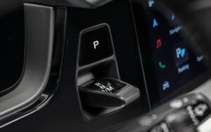
A better gear implementation ?
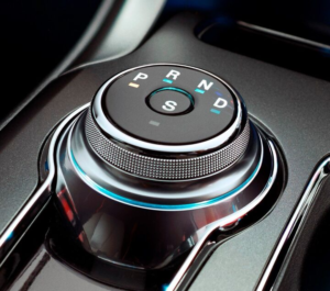
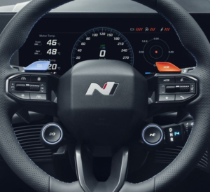
# A rotary knob as another extension to the steering. (Rotary gear + Hyundai knob)
# A gear shifter with placement similar to Push to start button. (Porsche’s new implementation)
Center console
More ranting
Let’s look at the cleared up space in the central console.
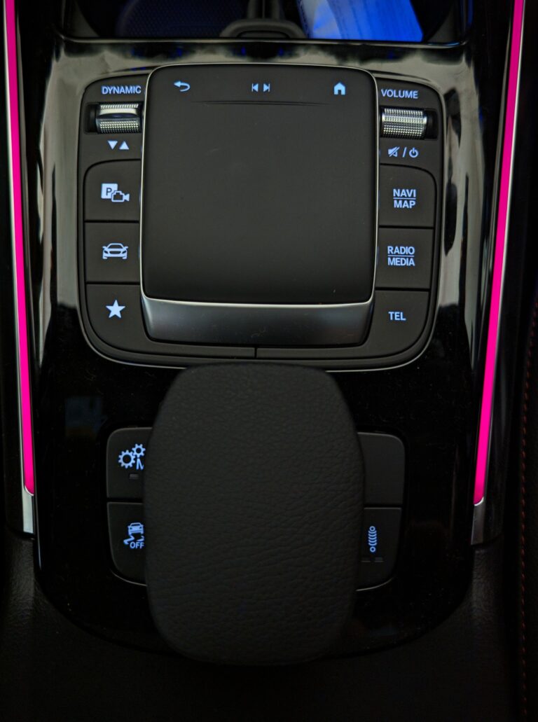
The buttons have appropriate placement. The main points of discussion are the trackpad and the resting surface behind it.
Is a trackpad really important?
The main screen can be controlled by touch, touchpad on the steering wheel and this trackpad.
The only useful function on the trackpad that isn’t redundant is the skip function which works with a swipe gesture. Also since the system can be operated only along the 2 axes, do we need a trackpad for operation? I would say it is not important.
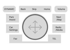
# The trackpad can be replaced by a knob that has joystick like function, press for select and separate back, home and skip buttons. (Or have good old traditional button layout. However it is important to differentiate from the other buttons around it to avoid misclicks.)
We can retain swipe function for skip, tap function on the knob to select or introduce a smaller button in the center with lower resistance to press.
A handrest?
The stand behind the trackpad serves primarily as a handrest, and its functionality is limited. In practical terms, many drivers tend to rest their hand on their thigh rather than on the center console (at least from my experience). Given that drivers in right-hand driving countries like India often need to raise their left hand to use the indicator frequently, this design can make the handrest less useful.
Peripheral sections
