This was my first project as a designer. I designed a mobile app to book musicians for various events. This was done as a part of the Google UX certification program. Let us take a look at it.
The prototype for the app can be accessed here.
The Layout and Features
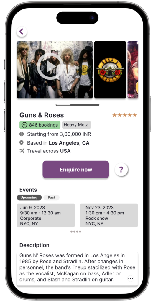
Band bio page with pictures on top. Clear button for inquiry. List of events already scheduled to avoid conflicts.
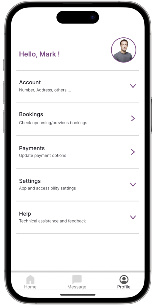
And finally the good old profile page.
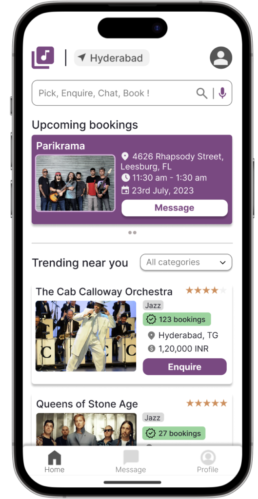
Upcoming bookings are on top. List of trending bands, genres, and additional necessary information.
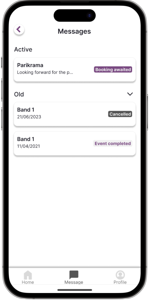
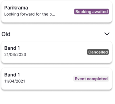
A dedicated messages tab after enquiry for booking and confirmation. Booking status indicated on the message section.
The not so important pages
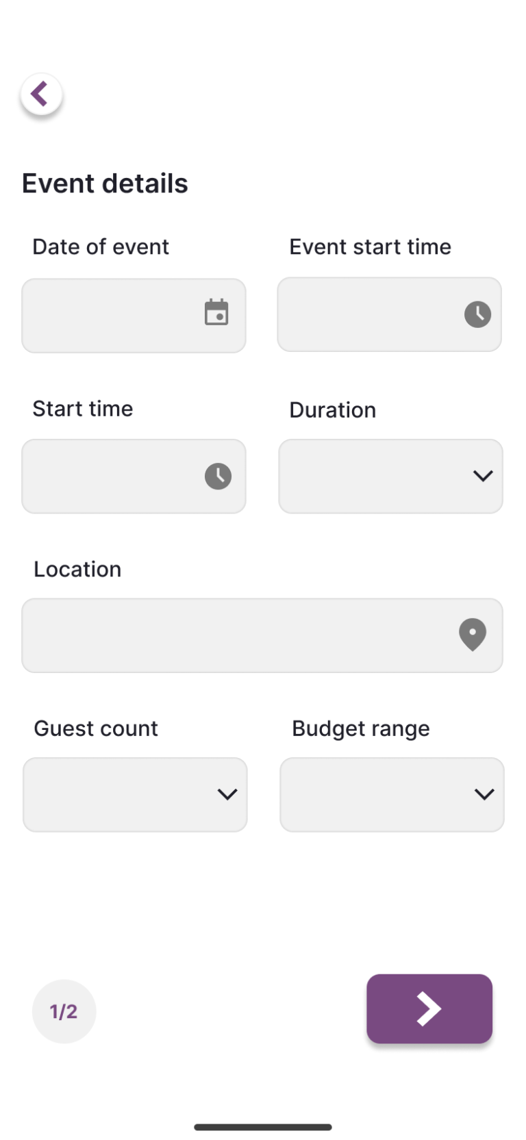
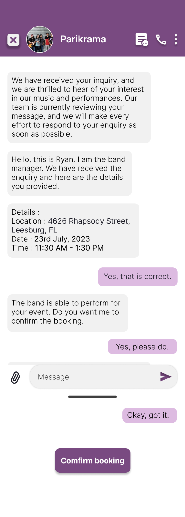
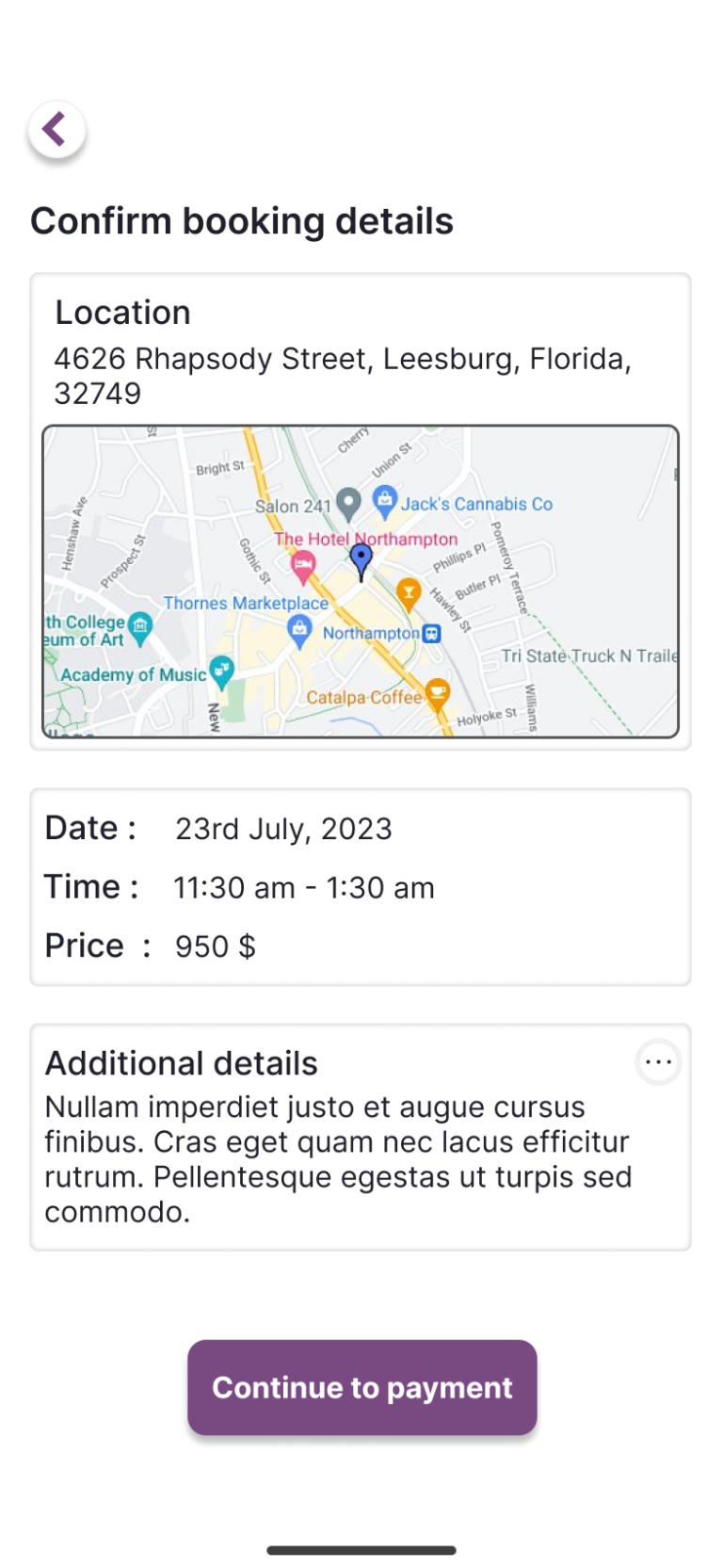
These are not the main pages but still need attention. I’ve demonstrated my design versatility by giving careful attention to various pages in a mobile app, even those considered less prominent.
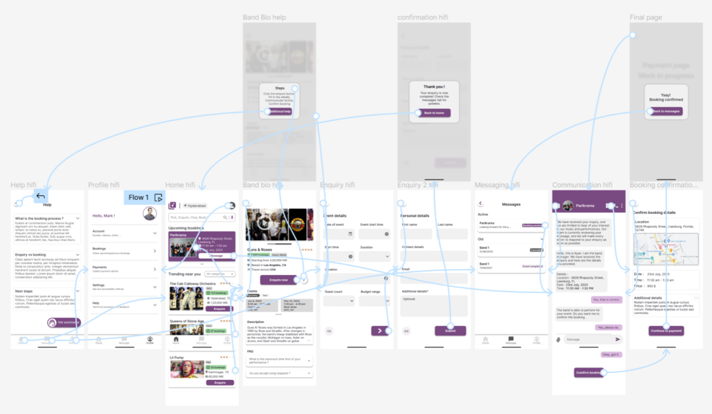
The full project – Case Study
I have followed the whole process of developing an app, starting from user research, personas, competitive audits, wireframing, feedback, low fidelity, and finally high fidelity prototypes. You can find the case study for this project in the below link.
What could I have done better ?
I think the layout is decent. But one thing that I noticed then and I still have in mind is the un-refined look. I think it is due to a combination of the font, color choices, use of generic icons, and definitely the shadows. But for a first project, I think its pretty neat.
What do you think? Please let me know in the comments below. Thanks for reading through.